Understand how color psychology impacts brand perception and customer emotions in marketing design.
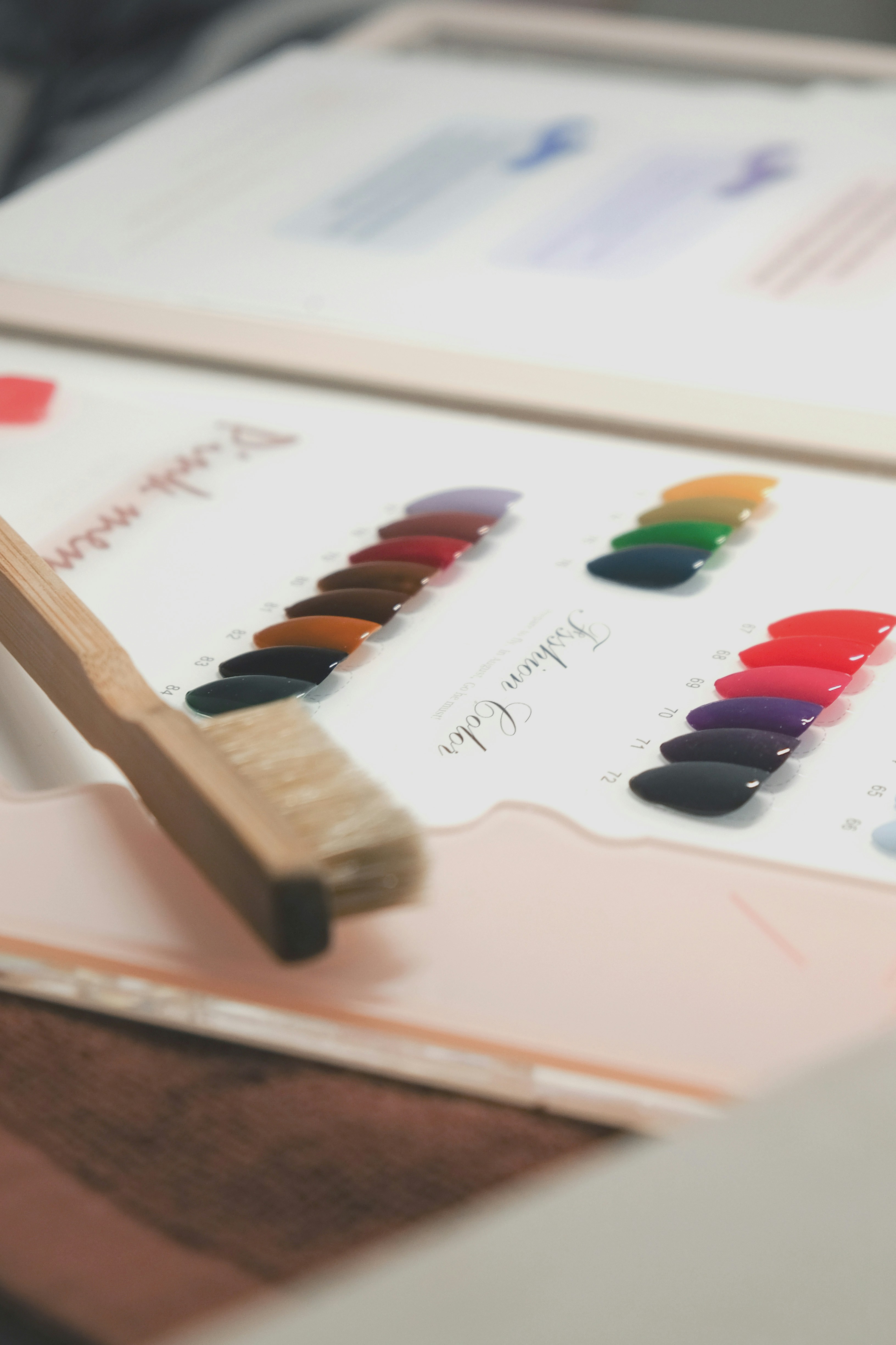
Colors do more than decorate, they influence how people feel and react. Blue communicates trust, red signals excitement and green reflects freshness or sustainability. Choosing the right color palette helps align your design with your brand message and audience.
For example, financial institutions often use blue for its association with security, while lifestyle brands prefer warm tones for energy and friendliness.
Designers use color psychology strategically in logos, packaging and campaigns to drive desired emotions. So, the next time you choose a design palette, think beyond beauty, think about what you want your audience to feel.

The right color combination can turn a simple design into a powerful brand statement.
“Design adds value faster than it adds cost.” – Joel Spolsky


